Imperfections and Intentionality
At what point do imperfections ruin a photograph? Cody Schultz contemplates this question as he looks back at images taken on a recent trip to the Palouse.
There is nothing worse than a sharp image of a fuzzy concept. – Ansel Adams
While on a recent trip to the Palouse with John Pedersen, I found myself in the small town of Garfield, Washington. With a population of 560 and an apparent lack of lasagna, I was intrigued by the old trucks, signs, and buildings which made up the town. There is something sad, yet beautiful, about places like this, where life is lived at a drastically different pace, where there lies a scent of death but not rot. Whether in Garfield or Endicott, Oakesdale or Colfax, I couldn't help but photograph what I saw. Part documentarian, part artist, I desired to showcase the allure in the supposed decay – a theme, of sorts, in most of my recent work.
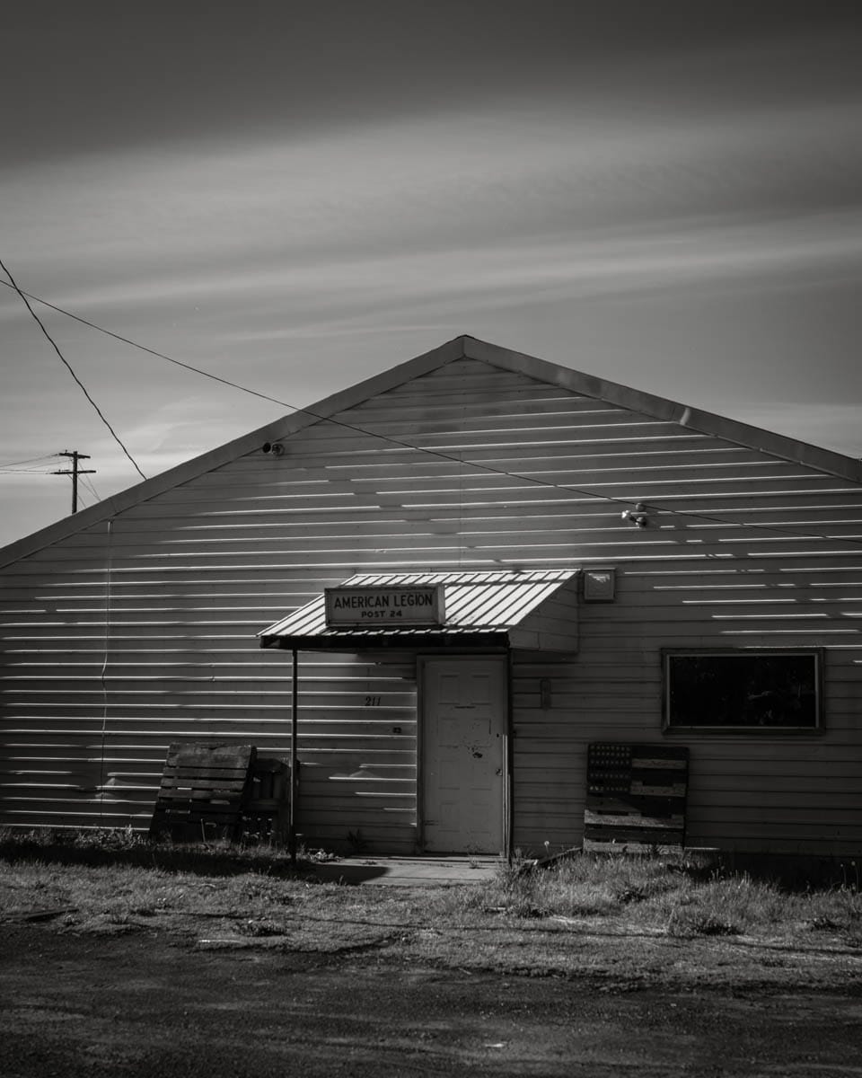
Upon entering the town, we paused to photograph the American Legion building, the first subject to intrigue me, though it took some encouragement from John to get out and build a composition.
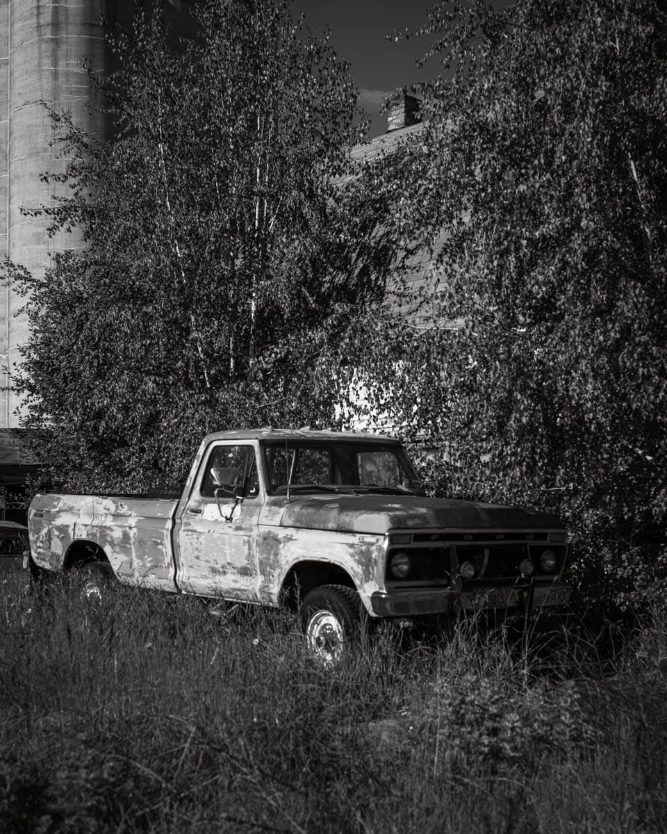
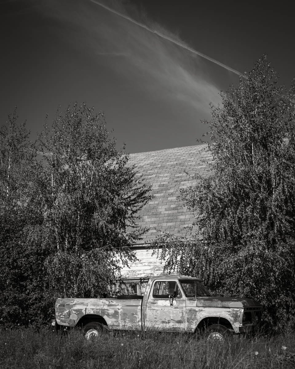
After finding a spot to park, a Ford truck, parked alongside a barn with a concrete building sat in the distance, drew my attention. Immediately, I foresaw the two following compositions, with later preference toward the side view. In the same vicinity, a barn and the intersection of two silos caught my interest.
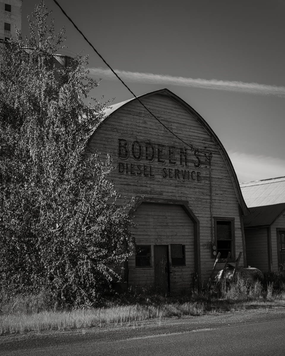
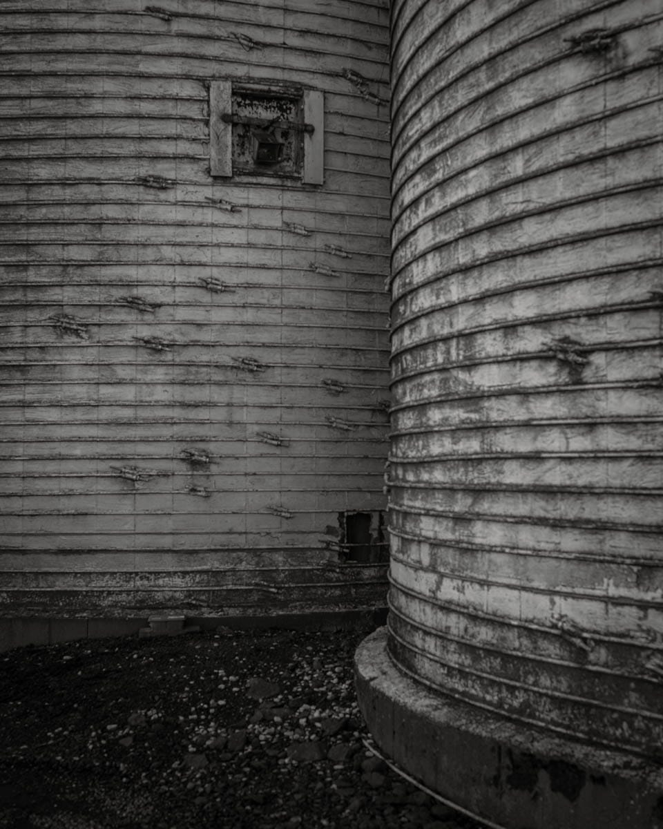
As I walked around, I kept my camera attached to my tripod, occasionally stopping when something caught my eye. With each step, with each corner rounded, my fascination grew. I paused to read the signs in various shop windows; I watched as townsfolk went about their errands, how few of them there were; and all the while, I thought to myself how odd it was for me, a self-described nature photographer, to be photographing what may only be thought of as Americana.
Years ago, when I first began taking pictures of nature, I was vehemently against the inclusion of man-made objects in my photographs. Telephone poles and vehicles were immediately cloned out in Photoshop, no matter how small in the frame. Though part of me could see their potential beauty, neither churches nor abandoned buildings would ever be subjects in my work (or, so I thought). With time, I began to mature as both an individual and an artist. My interests grew beyond waterfalls and ferns, toward intimate forest scenes, humanity's part in nature, and, perhaps most interestingly, the dichotomy of life and death.
Even though I was not as against the inclusion of the human element as in years past, to showcase buildings and vehicles outside of the forest, as the primary subject, was an oddity for me. Yet, I couldn't help but be engrossed by it all. In hindsight, this may be for two reasons:
- I have a deep appreciation for story and emotion in my photographs, and towns such as Garfield are filled with both.
- As mentioned, a lot of my recent work plays on the dichotomy of life and death. Sometimes this is more obvious, but Americana allows for a different point of view on the idea, an alternative representation.
Knowing this, perhaps you can understand my disappointment when, upon reviewing the files in my hotel room, I noticed only a few of them were properly focused.
For ten years, I have been (somewhat seriously) playing with a camera. For five of those ten, I have utilized various film cameras, where manual focus and close attention are required. Despite this, and in spite of focus peeking and easy magnification on the LCD, I managed to mess up focus on most of the photographs taken while in town. I can't even blame it on camera movement from wind or a shaky hand, as I used my tripod for every shot. So, what happened? The only logical conclusion I can come to is a case of over-confidence. Instead of properly checking to ensure focus was where I wanted it, I relied on focus peeking which, from a quick glance, made it seem like everything was good to go.
This brings me to wonder: At what point do imperfections ruin a photograph?
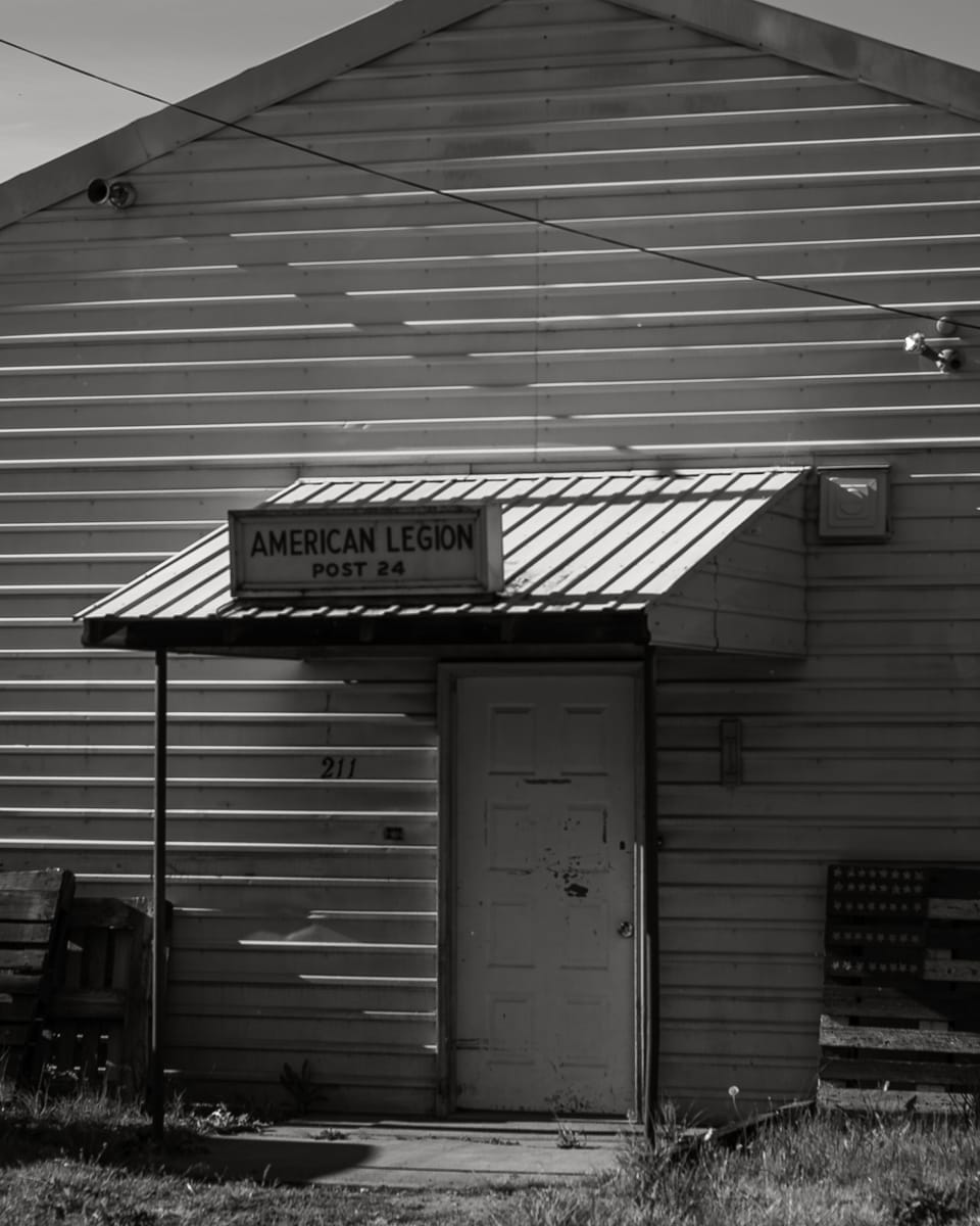
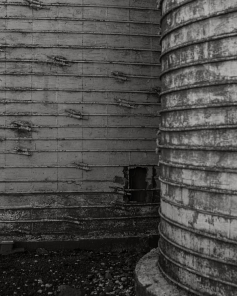
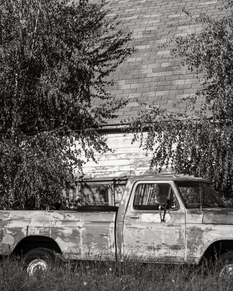
Zooming into my three favorites from Garfield, you can tell the focus is off – but is it off by too much? Upon printing these images – first at 8x10", then a crop of a 16x20" file, both on 8.5x11" paper – I'm not so sure. Realistically, most viewers won't even notice. Unless you press your nose to the paper, I would argue many photographers wouldn't realize my mistake, either. In fact, I can almost say this with the utmost certainty, albeit with a different photograph.
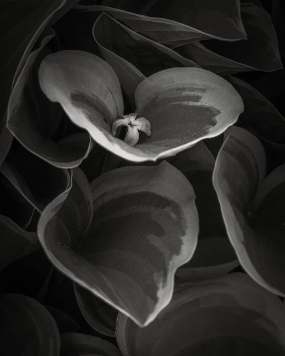
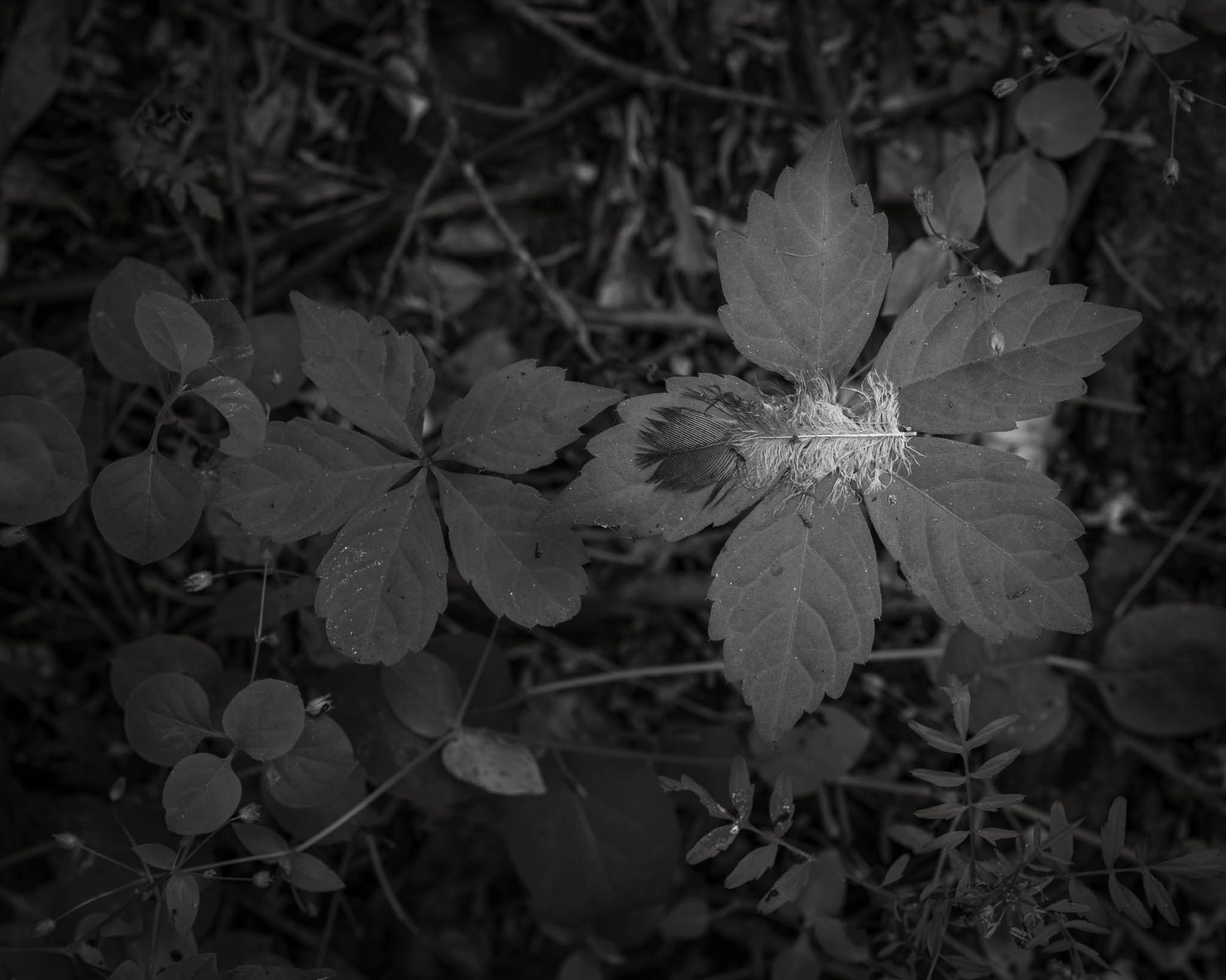
I made a similar error with a composition of a Buddleja petal nestled in a hosta; rather than the petal being in critical focus, it is the section just before it that is. When I shared the print of this image with a fellow photographer, she mentioned she wouldn't have even noticed, had I not pointed it out.
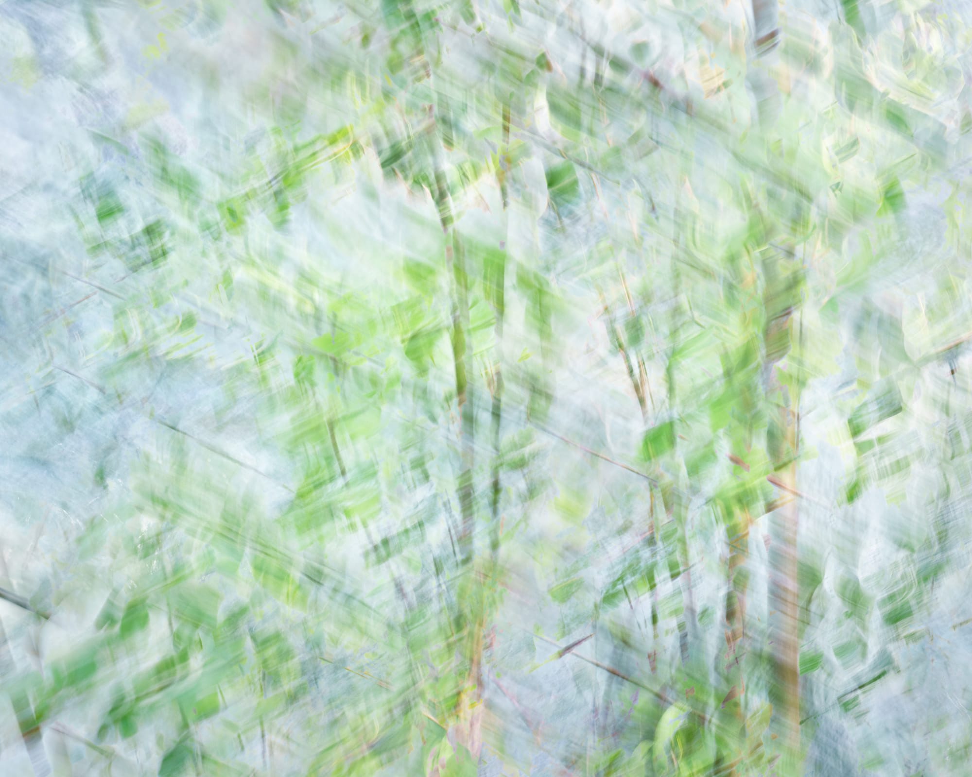
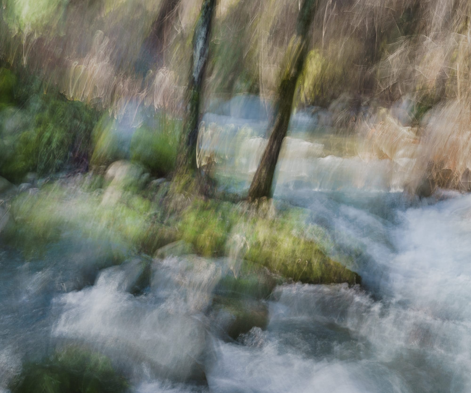
All of this being said, I question my own standings on whether such technical imperfections should ruin a photograph, or whether the emotional power within them is enough. I think of the work created by such artists as our featured photographer, who utilizes the pinhole technique to create dreamy photographs which are rarely "sharp." Yet, these are works created with an intention, which is different than missing focus and thinking the photograph is still usable (or worse, savable using today's technological advancements). And that is where the difference comes into play.
When thinking about the photographs highlighted above, I do not think of them as outright failures. In a way, they are still usable and, as stated, many viewers would likely give the focusing issues a pass, thinking there is some level of intentionality, if they even notice. However, they were not intended to be as they are; while working the compositions, I intended for the primary subjects to be in-focus, with the background gradually falling off. Had this not been the case, had I instead wished for everything to be slightly out-of-focus or for the viewer's attention to be drawn to the barn, rather than the truck, for instance, this would be a different story.

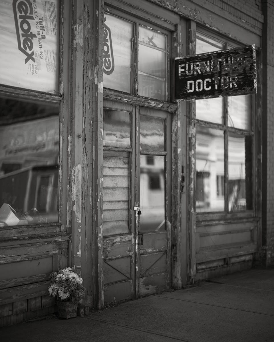
Take, for example, the photograph above, of a flower-filled pot in front of an old store. As I worked the scene, I knew a few things to be true: the flowers are the primary subject and therefore should be in sharp focus; the store sign is the secondary subject and, if not in sharp focus, should at least not be blurred entirely; and I knew I wanted the face of the building to fall off as rapidly as possible, to provide the appropriate level of separation between it and the subjects just named. To achieve this, I utilized my Mitakon 65mm f/1.4 lens, wide-open, which equates to, roughly, 50mm at f/1.0. If the flowers were not sharp, as desired, that would ruin the photograph; but I understood that, due to the characteristics of this lens and the large aperture, it is unlikely every flower in the pot would be in crisp focus. Not only was I aware of this prior to releasing the shutter, I was okay with it -- and intended it to be that way, else I would have altered my settings.
Over the course of the past few weeks, since returning home from the Palouse, I have continued to alter my thoughts around imperfection in photography and whether the photographs taken in Garfield belong in my portfolio. I think of the epigraph that heads this essay, and I ponder whether the concept of the photographs is sharp enough to mitigate the mistakes made. In truth, though I still hold a degree of attachment to the work, I do not believe it is. Perhaps others feel differently; subjectivity is, after all, what makes art, art.
At the end of the day, I am left with more questions than answers. Namely, I question whether we are too hard on ourselves and our art. When you look at what is posted online, it appears as though mistakes are never made, that everyone is perfect, though we know this is not true. A part of me wonders if the world wouldn't be a better place, if we allowed for a few more flaws to shine through.
Featured Photographer
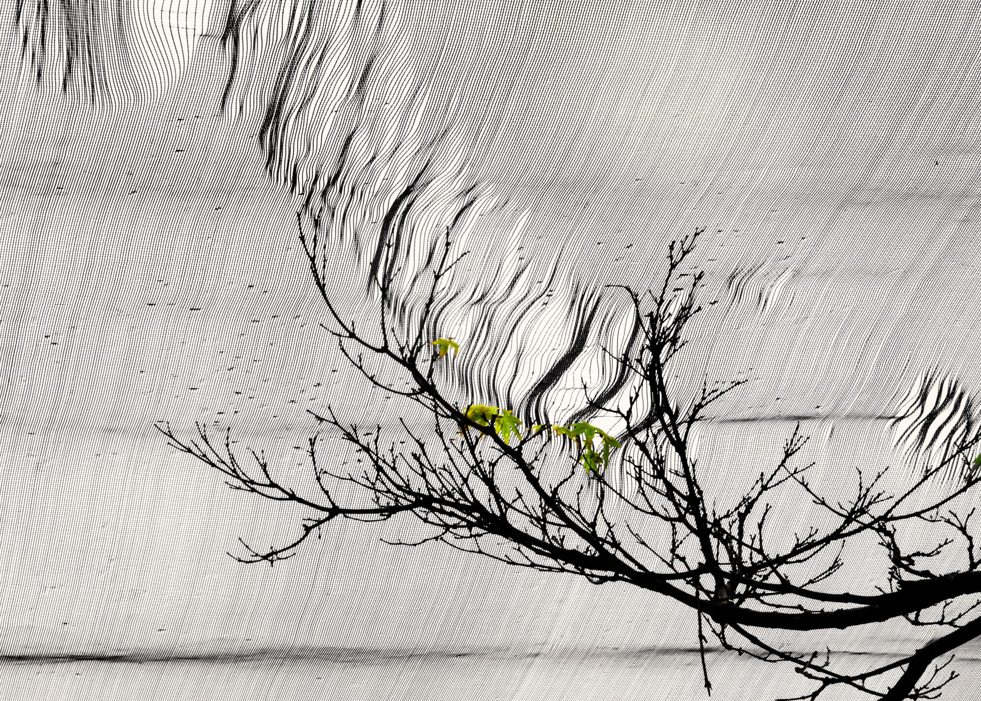
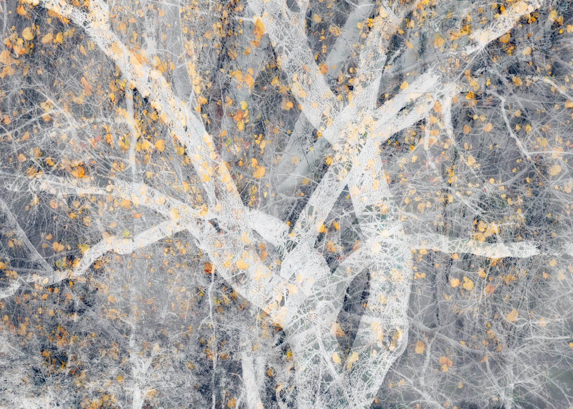
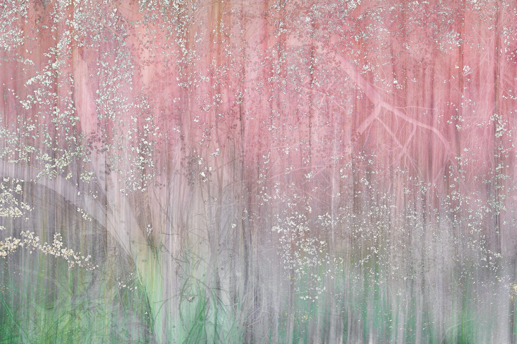
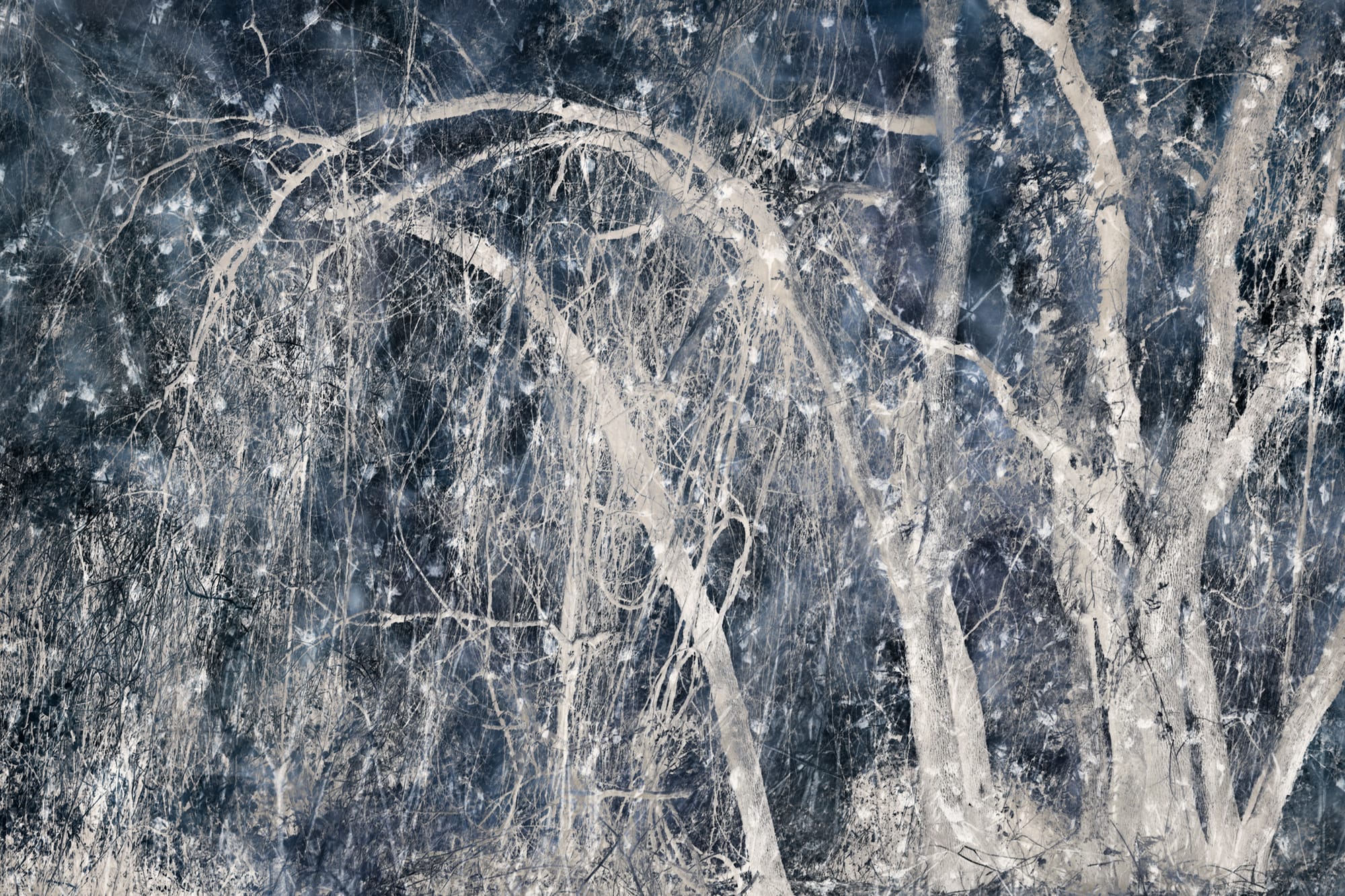
While thinking about these out-of-focus photographs from Garfield, my mind wandered toward abstract photography. Despite having a love for this art genre, I have never pursued it to the degree I would like; each time I see a finely-crafted photograph which utilizes intentional camera movement, or makes me sit and ponder just what it is I am looking at, this love is reignited. That is exactly how I feel as I puruse the gallery of NPN member, Bonnie Lampley.
Having fallen in with photographers who praise the creative over the technical, Bonnie has enjoyed photography since 2011. She decided to join NPN in 2019 after seeing Guy Tal's article, The Mindful Photographer, and she has been a valued contributor ever since. These days, she spends most of her time in far northern California, practicing what Brooks Jensen calls, "photography by wandering about."
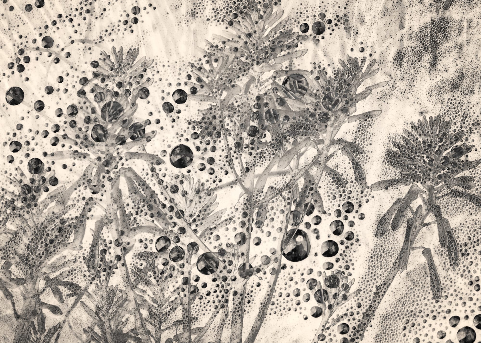
What I love most about Bonnie's work, is her dedication to seeing nature with fresh eyes. Not everyone see the potential for an abstract photograph, let alone execute it; Bonnie manages to do both. Take, for example, the photograph above, the monochrome image of bubbles and plants. Past the technical execution of the photograph being well-done, you cannot help but wonder what you are looking at. Bubbles and plants, yes, but what kind of plants are these? Are they some sort of aquatic species, or perhaps are they behind a misted pane of thick glass? I won't spoil the answer – most the fun is in the questions, anyway – but if you're curious, you can check it out here.
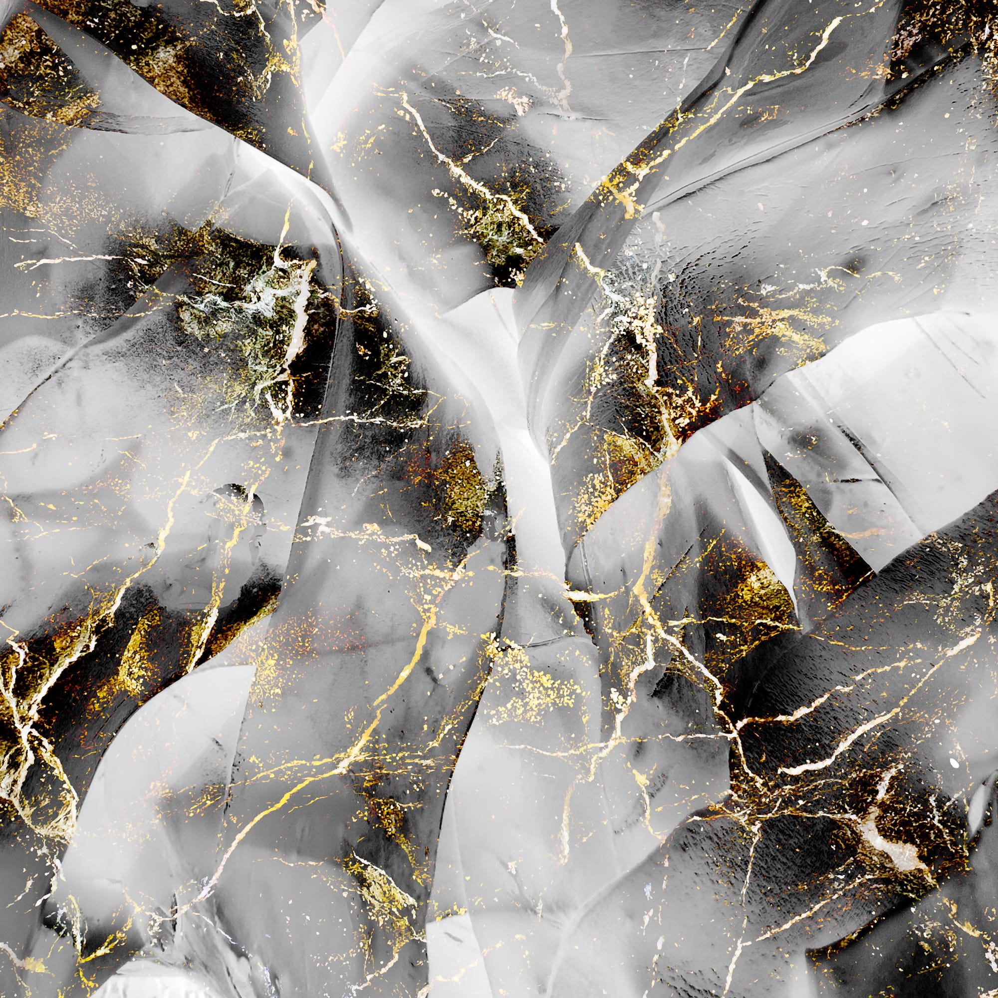
Another, which held my interest, is above. Again, this photograph raises more questions than answers, the first being, What am I looking at? At first sight, I assume it is some close-up of a granite or marble countertop -- but it's not. I continue to look, more closely, spending time contemplating what it is I am looking at. This is the enjoyment of abstract art, the idea that you don't know exactly what you are looking at or, perhaps, even why you are drawn to it -- but you are, nonetheless.
The intentionality and allowance of imperfections in abstract art helps to create visually fascinating photographs, which, when done right, make you ask more questions than you coud ever have answers for. I highly recommend looking at Bonnie's portfolio and spending time with her work.
